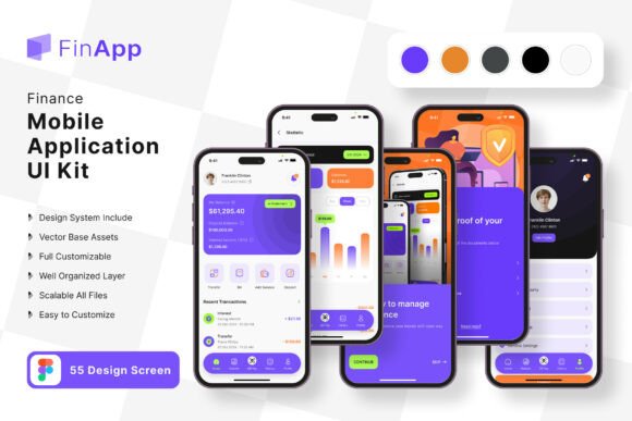
Finance Planner App UI Kit: Your Shortcut to a Polished Mobile Experience
Building a finance app from scratch can feel like an overwhelming task. You have the core idea—maybe it's a budget tracker, an investment portfolio manager, or a simple expense log—but staring at a blank screen in your design software is daunting. The gap between a great concept and a professional, user-friendly interface often comes down to time, resources, and design expertise. This is where a comprehensive UI kit changes the game, offering a launchpad that transforms the development process.
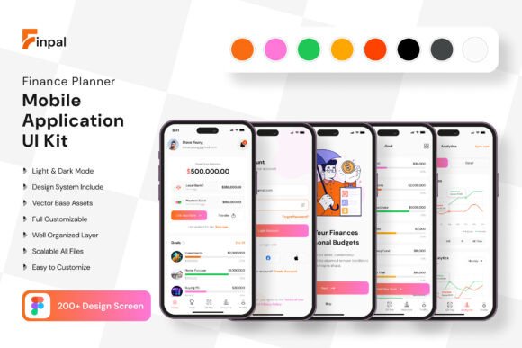
The Finance Planner App Mobile UI Kit is a curated collection designed specifically for this purpose. It consists of 200 high-quality, pixel-perfect screen templates that provide a robust foundation for any financial application. Instead of reinventing the wheel with every button, card, or chart, you start with a library of professionally designed components. This approach isn't about cutting corners; it's about working smarter, allowing you to focus your energy on the unique features and logic of your app rather than its foundational visual design.
More Than Just Templates: A Visual System for Trust
In the world of finance, visual communication is synonymous with trust. Users need to feel confident that their data is presented clearly and that the application is reliable. The UI kit understands this, offering a clean, modern aesthetic characterized by intuitive layouts, ample white space, and a balanced color palette. The screens are designed for readability and quick comprehension, which is critical when users are reviewing account balances, transaction histories, or financial forecasts.
This isn't a collection of random screens. It's a cohesive design system. With over 80 UI elements—from buttons and input fields to complex data visualization components—you can maintain perfect visual consistency across every page of your app. This consistency is a cornerstone of strong brand identity and a professional user experience. The included free fonts and icon vectors further ensure that your application has a unified look and feel from the first tap.
Practical Applications for Designers and Entrepreneurs
For the freelance designer or small agency, this kit is a powerful design asset. It drastically reduces the initial wireframing and high-fidelity prototyping phase. You can present clients with interactive, polished mockups in a fraction of the time, using the templates as a customizable starting point to align with specific brand guidelines. The fact that it's fully editable in Figma means the entire team can collaborate seamlessly, with every vector element being 100% scalable and easy to modify.
Entrepreneurs and startup founders, even those without deep design skills, find immense value here. It allows you to move beyond a basic wireframe and communicate your vision to developers and investors with a high-fidelity prototype that looks and feels real. You can customize the screens by adding or subtracting elements to match your exact feature set, ensuring the design serves your specific business logic. This tangible representation of your product can be invaluable for gathering early feedback and securing buy-in.
Streamlining Your Workflow and Enhancing Brand Recognition
One of the most significant advantages is the acceleration of the brand identity development process. A well-designed app interface is a direct extension of your brand. By using and customizing this kit, you’re not just building an app; you’re crafting a brand experience. The clean lines and modern typography can be adapted to feel cutting-edge, minimalist, or approachable, depending on your color and font choices. This helps in creating a memorable product that stands out in a crowded app store.
The workflow efficiency extends beyond initial design. When it comes to creating marketing assets—like social media graphics, website hero images, or presentation slides—you already have a library of consistent, on-brand visual elements to pull from. This ensures your promotional materials have the same polished look as the app itself, strengthening overall brand recognition. The kit’s structure, with its symbol objects and fully layered files, makes it simple to extract and reuse components across different projects.
Getting the Most Out of Your Design Toolkit
To leverage a UI kit effectively, start by exploring its full range. Don’t just dive into the screens; familiarize yourself with the foundational UI elements. Understanding the button styles, iconography, and typographic hierarchy will give you greater control when customizing. Think of the kit as a dialect of a design language—learn its vocabulary first, and you’ll be able to write more compelling sentences.
When customizing, consider your target audience. A finance app for young adults might use bolder colors and more playful icons, while one for enterprise clients would lean into muted tones and sophisticated data displays. Use the kit’s scalable vectors to adjust layouts for different content densities. Always test your customized designs for readability across various device sizes. The included free font is a great starting point, but ensure any new font you pair with it maintains legibility at small sizes, especially in lists and charts.
Finally, remember that this toolkit is a starting point, not a finished product. The real magic happens in the customization—tailoring the flows, interactions, and visual details to create a unique experience that solves your users' specific financial management challenges. It provides the professional scaffolding, allowing your unique idea to shine through with clarity and confidence.