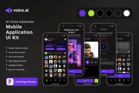
Ai Voice Generator App Mobile UI KIT: Streamline Your App Design
Imagine having a brilliant concept for a voice-driven application—perhaps a tool for podcasters to edit audio with voice commands, or a creative app that generates unique vocal effects. The idea is solid, the market is there, but the blank canvas of a design tool feels paralyzing. Starting from zero, screen by screen, is a monumental task that drains momentum. This is where a strategic design asset transforms the process from daunting to doable. A well-structured mobile UI kit acts as your architectural blueprint, providing the foundational structure and visual consistency you need to build a professional application efficiently.
Beyond Templates: A Foundation for Rapid Prototyping
The Ai Voice Generator App Mobile UI KIT is more than a collection of pretty screens. It’s a comprehensive design system containing 19 pixel-perfect templates and over 80 UI elements. Think of it as a starter kit for your app’s entire visual language. Instead of designing a settings menu, a profile page, or an audio waveform display from scratch, you begin with professionally crafted, fully editable components. This allows you to focus your creative energy on the unique features that will set your app apart—the core voice interaction model, the specific filters, the social sharing mechanics—rather than reinventing standard interface patterns.
The practical value here is immense for entrepreneurs and small teams. You can rapidly assemble a high-fidelity prototype in Figma, test user flows with real stakeholders, and iterate on the design before a single line of code is written. The 100% scalable vectors and symbol objects mean that adjusting a button size, changing a color scheme to match your brand identity, or reorganizing a layout is straightforward. You’re not locked into a rigid template; you’re given a flexible toolkit to build your own vision. This accelerates the path from concept to a tangible, testable product, saving weeks of initial design work.
Practical Applications: From Prototype to Polished Product
The true test of any design asset is its utility across different project phases. This mobile UI kit excels in bridging the gap between an idea and a market-ready design. For a content creator developing a companion app for their audience, these screens provide an instant professional framework. You can mock up a login screen that feels secure, a main dashboard that intuitively displays voice files, and a recording interface that looks clean and functional. This polished visual presentation is crucial when pitching to investors, recruiting developers, or simply getting feedback from potential users.
For a small business owner, the applications extend beyond the app itself. The consistent visual system established in the UI kit can inform your broader brand identity. The color palette, iconography, and button styles used in the mobile app can be adapted for your website’s design, your social media graphics, and even your packaging if you sell related products. This creates a cohesive experience for your customers, whether they’re interacting with your app, browsing your site, or unboxing a physical product. The kit becomes a central reference point for maintaining visual consistency across all touchpoints.
Furthermore, the included free fonts and icon vectors are practical design assets in their own right. The typography choices made within the kit are optimized for mobile readability, which can serve as inspiration for your blog or editorial layouts. The icon set can be repurposed for marketing materials, presentation decks, or instructional guides. You’re not just buying 19 screens; you’re investing in a mini design system that can seed multiple creative projects.
Designing for Clarity and Engagement
In the crowded space of mobile applications, first impressions are formed in milliseconds. A cluttered, confusing, or visually unappealing interface will drive users away, no matter how powerful the underlying technology. This is where the principles of modern typography and clean UI design become critical. The Ai Voice Generator App Mobile UI KIT is built on these principles. The layouts prioritize readability with clear visual hierarchies, ensuring that users can navigate complex audio controls without feeling overwhelmed.
Consider the importance of font pairing in your app’s design. The kit’s use of clean sans-serif fonts for body text ensures maximum legibility on small screens, while a more distinctive display font might be used for headers to inject personality. This balance is key to professional presentation. When you customize the screens, pay close attention to how typography guides the user’s eye. Are action buttons clearly labeled? Is the most important information—like a recording time or a file name—instantly recognizable? The template gives you the structure; your job is to refine the messaging and flow for your specific audience.
The vector-based, fully layered nature of the design files in Figma means you have complete control over these details. You can experiment with different color styles to evoke the right mood—energetic and vibrant for a music app, or calm and professional for a business voice memo tool. You can ensure that interactive elements like sliders for audio editing or toggles for settings have clear states (active, inactive, pressed). This meticulous attention to detail is what transforms a functional app into one that feels intuitive and enjoyable to use, directly impacting user retention and engagement.
Making the Asset Work for You
Adopting a UI kit is a strategic move, but it requires a thoughtful approach to yield the best results. Start by reviewing all 19 templates to understand the full scope of what’s provided. Map them to your app’s core features. Which screens are directly applicable? Which will need significant modification? This assessment will save you time later.
Next, focus on customization. The first step is often establishing your brand’s color style. In Figma, you can easily update the color variables or styles used throughout the kit to reflect your own palette. This single change will instantly make the designs feel more “yours.” Then, examine the typography. While the kit includes free fonts, consider if they align perfectly with your brand voice. If not, you can swap them out, but ensure you maintain the same level of readability and hierarchy the original design intended.
Finally, use the kit as a collaborative tool. Share the Figma file with your team, your developer, or a focus group. The tangible, interactive prototype it enables is far more effective for communication than verbal descriptions or rough sketches. You can gather specific feedback on button placement, text clarity, and overall user flow. This iterative process, powered by a solid design foundation, is how you build a mobile application that is not only visually appealing but also functionally robust and user-centric. The kit removes the barrier of starting from nothing, allowing you to immediately engage in the critical work of designing for your users.